
A HISTORY OF BRADFORD CITY AFC IN OBJECTS
Published in the match day programme: Bradford City v Bristol Rovers, 29-Sep-18
In the early 1970s football identities were subject to further radical change and a shift to minimalist design. Forged on the back of an envelope (literally so) in the commercial office at Valley Parade in the close season of 1974 came the ‘bc’ logo which was described in the programme as having a 32 panel football in the centre.
![]()
Featured above is a lapel badge of the era based on the design.
The new Bradford Metropolitan District Council had itself adopted a modern style monogram bmdc logo without any reference to traditional heraldic devices (see below). In the space of a few weeks in the spring of 1974, both the old city of Bradford authority and Bradford Park Avenue AFC had disappeared – the latter after sharing Valley Parade for its final season.
![]()
The introduction of the new logo at Valley Parade was about signalling a new era. Chairman Bob Martin also wanted to show that a new regime was in place following the departure of Stafford Heginbotham in November, 1973. Martin had assumed power with the promise that he and his fellow directors would introduce new money and new ideas.
In April, 1974 the Bradford City board announced its decision to rename the club as Bradford Metro FC to signify a fresh start as a united Bradford club. The timing was in response to the demise of Bradford Park Avenue but the choice of name was inspired by changes in government organisation that year, considered to be radical and ‘modernising’. Bob Martin was convinced that the new metropolitan district would bring with it more people who would identify with Bradford and that the sole remaining football club in the district needed to capitalise on the opportunity. Like the new club identity, the proposed team colours of amber and brown (the same as the new Bradford authority and its dustcarts) were equally radical. However City supporters, backed by former chairman Stafford Heginbotham, were unanimous in rejecting the proposal which the directors were then forced to abandon.
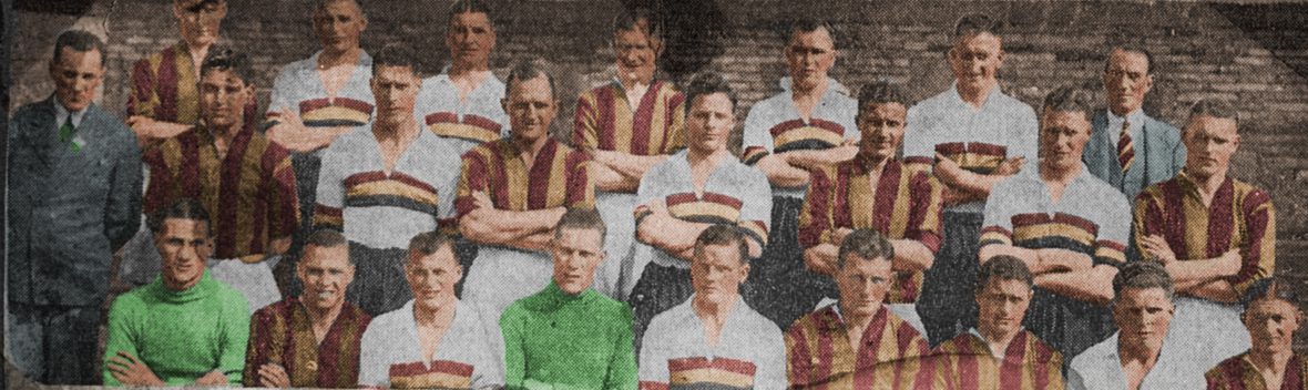
The ‘bc’ logo took its place on the cover of the programme in August, 1974 displacing the popular City Gent character that had been a feature of the previous eight years. As if that was not enough, Martin introduced a predominantly all-white playing strip with solitary claret and amber stripes as a sop to tradition. Although white had been the club’s traditional third colour it rankled the sensibilities of the faithful during the course of the next eleven years.
John Dewhirst
Postscript
In 1969 Bradford Corporation introduced a new logo to signify a modern identity for the city and this was briefly adopted by both Bradford clubs. However the BCAFC shirt badge from 1970 appears to have been a one-off, possibly designed on a speculative basis that never featured on the team strip.

John’s book A HISTORY OF BCAFC IN OBJECTS (vol 1 in the BANTAMSPAST HISTORY REVISITED series) provides background about City memorabilia. In future issues of The Parader he will feature objects that tell the history of the club. If you have a City artefact in your possession that you would like him to feature in the programme contact him at johnpdewhirst at gmail dot com or tweets @jpdewhirst
John has written widely about the history of sport in Bradford: Links to his features on the history of Bradford sport
Features on the BCAFC identity:
Bradford City AFC & the Boar’s Head identity
Application of the Bradford civic crest
How Bradford City became known as the Bantams
Elsewhere on this blog you can find his programme articles from earlier games this season and last.
===============================================================
Details here about the new bantamspast History Revisited book by Jason McKeown and other volumes in the same series: BANTAMSPAST HISTORY REVISITED BOOKS
==============================================================
Discover more about Bradford football history at www.bradfordsporthistory.com
