

Possibly the most well-known monogram crest used by a British football club is that of Glasgow Rangers. This is said to date from the club’s formation in 1872 although notably the oldest surviving artefact featuring the scroll dates from the 1881/82 season. (It is questionable whether the club adopted a crest on formation and my bet is that the RFC monogram dates from later.) Rangers have two separate crests and in 1959 the club adopted its ‘lion rampant crest’ incorporating the club’s motto ‘Ready’, shortened from Aye Ready (meaning Always Ready in Scots). The monogram crest is currently used as a shirt emblem whereas the lion rampant design is used as a formal crest, an example of the fact that football club branding does not necessarily have to be confined to a single badge.


The Dundee FC crest is another example of a classic monogram as below.
![]()
The monogram style was commonplace among football (rugby and association) in the late nineteenth century, typically applied to blazers and/or caps and used on letterheads or formal correspondence. These applications were distinct from merchandising which was virtually non-existent. Similar well-known monogram designs were later used by Arsenal and Everton. The use of monograms in sport has not been unique to Britain and the classical form is common among Australian cricket organisations (featured below are those of the Melbourne Cricket Club and the West Australian Cricket Association). American sports clubs have similarly applied monogram logos.


In Bradford, a monogram style was adopted by Bradford FC in the 1880s (at that time a Rugby Union club) based at Park Avenue as the following season tickets illustrate.

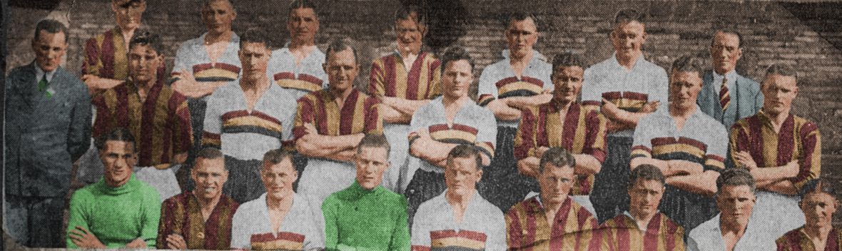
The Manningham (rugby) football club at Valley Parade likewise adopted a monogram motif for club caps as the following from 1891/92 (which belonged to celebrated full-back George Lorimer) demonstrates.

The following motifs were used in the design of a scroll presented to the outgoing Bradford City AFC chairman Alfred Ayrton in January, 1907. Having been involved at Valley Parade in a leadership capacity from 1899 the scroll incorporated a crest to represent his association with the former Manningham FC as well as one for Bradford City.


Shortly after, the club adopted the new Bradford coat of arms (granted to the city on 31st December, 1907) and I have seen no other instance of the above monogram motif being used by Bradford City AFC. Accordingly there was probably a degree of artistic licence in its design to complement a Manningham FC monogram.

In April, 1908 the above motif was applied to a menu of a dinner to celebrate the promotion of Bradford City AFC as champions of Division Two. Again there seems likely to have been artistic licence rather than compliance with branding guidelines as would be the case nowadays. The simplicity of the design is striking and so too the similarity with the shield that features in the current club crest (below).

In September, 1908 the following pin badges were advertised in the Bradford Daily Telegraph by Messrs Fattorini. The timing coincided with the introduction of the new Bantam identity (refer link below for further information) and came when the club was actively trying to raise morale among supporters. There is no evidence that they were sold to raise funds for the club as opposed to being a marketing initiative to lift the club’s profile and self-esteem.
![]()
The design was never adopted as a formal crest by Bradford City AFC (who adopted the civic crest) but it was embraced by the Bradford City Shareholders and Supporters’ Association that was established in March, 1921 to provide active support to the parent football club. The scroll motif was used in enamel badges as shown below.

The BCAFC monogram or scroll badge was thereafter set aside. In 1949 when the BCSSA was reformed to help raise funds for the parent club its emphasis was on the Bantam identity. Nevertheless a monogram design of sorts was reintroduced in 1968 with the new boar’s head crest. Whilst considered something of a classic, the weave of the BC lettering is an optical illusion which detracts from the design.

In 1969 Bradford City toyed with adopting the new marketing logo of the Bradford Chamber of Commerce. Whilst there is a surviving photograph of this being adopted as a shirt badge, to my knowledge it was never worn in a first team game (which may have been due to licensing issue or the absence of approval by the Football League). The same style also featured in a Bradford Park Avenue pennant c1971.

Monograms of sorts were revived by Bradford City in the form of the embroidered motif on shirts and shorts between 1972-75 and from 1974 with the so-called ‘BC logo’. The former style had been fashionable among British clubs during the preceding five years and that illustrated below was on the City shirt of 1973/74. (NB the club had always referred to itself as BCAFC with emphasis on it being an association / soccer club but presumably the embroidery template did not allow five letters.)

If the above was inspired by classic design, the BC logo (below) of 1974 was distinctly more modern and coincided with the introduction of the new Bradford metropolitan district crest that replaced the traditional civic coat of arms in the same year. (Further detail from the link below.)
![]()
You can find further detail about the evolution of Bradford City crests and club identity on this blog from the links below:
Bradford City AFC & the Boar’s Head identity
Application of the Bradford civic crest
