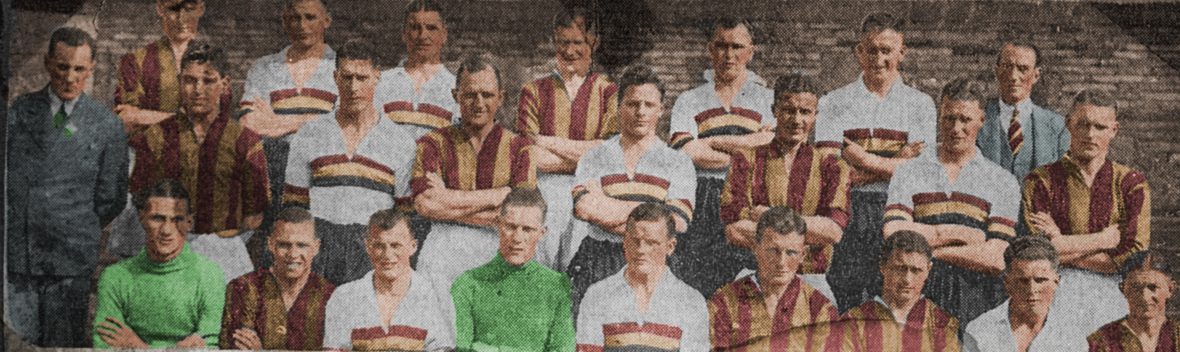


The last thirty years has arguably been the most eventful era in the history of BCAFC – three promotions; four relegations; a record-breaking Wembley cup final; two seasons in the top flight; 31 managerial appointments since 1990; two formal insolvencies; foreign ownership; and latterly, a celebrity manager. During that time we’ve had striped shirts, hoops, diagonals, electric flashes and countless other shirt permutations. The one constant has been the crest.
The current crest was introduced in the 1991 close season. In common with previous changes of crest it was occasioned by regime change albeit without any form of supporter consultation. For example the City Gent character (1966) and boar’s head character (1968) had been introduced by Stafford Heginbotham. In 1974 Bob Martin dispensed with both to signal his ownership and thus came the ‘bc’ monogram inspired by the new Bradford Metroplitan District Council logo. In 1981, by which time Valley Parade was looking distinctly tatty, Bob Martin revived the bantam identity to convince people of a new found confidence under Roy McFarland.
After the receivership of 1983 Stafford Heginbotham and Jack Tordoff abruptly reverted to the boar’s head crest. And finally in 1991, incoming chairman and owner David Simpson introduced the current crest incorporating elements of the boar’s head / shield design and a revival of the bantams identity. As if to remind people of the club’s nickname, ‘The Bantams‘ was added beneath the shield which was just as well considering that the bird at the top looked more like a baby hen (pullet).
Barring a version introduced to commemorate the club’s centenary season in 2003/04, and minor tweaks such as black outlines, the current crest has been a constant and can boast having been the second longest used crest at Valley Parade after the original Bradford Corporation civic crest which was adopted between 1907-66. In practice the latter had limited application and of all the crests adopted post-1966, the current version has been in use for the vast majority of the time (ie 31 of 56 years). Hence the current version has become the most used.
In turn the current crest is the most familiar having had application on countless items of merchandise as well as exposure on TV and social media etc. That City’s modern support base in the past thirty years has been bigger (as well as generally younger) it means that a declining minority has been familiar with anything else. Little wonder then that the recent survey of supporter views confirmed that only a small proportion of fans (myself included) favoured some form of boar’s head / civic identity revival.
Nevertheless the existing crest has survived as a consequence of inertia and economy rather than on account of its intrinsic design. Changing the identity had hitherto been considered a low priority on account of the effort and expense. My gripe has been that in terms of emphasising the club’s bantam identity the current crest does a very poor job. Not only is the bird unrecognisable as a bantam it singularly fails to capture the essence and the colours of the bantam nickname – the character having been adopted in 1908 to reflect both an underdog fighting spirit and the club’s colours. What we have is a white pullet, a long way removed from the plucky, assertive Bantam that it is supposed to represent. Frankly it is an embarrassment.
The club has had a bad record in terms of a graphical depiction of a bantam. You need only look at the designs introduced in the 1980s as a demonstration of this and in fact the most convincing post-war effort was that introduced in 1949 which was copied from the BSA Bantam motorcycle marque. The sad reality is that those responsible for the bantam drawings had little idea of what a bantam looked like and its relative dimensions. Furthermore, the crests introduced in the 1970s and 1980s were all without exception kitchen table affairs, literally on the back of an envelope.
In September, 1981 Scunthorpe United had a competition to design a new badge and invited people to submit designs. On the way back to Bradford from our game at the Old Show Ground in Scunthorpe I sketched a design, submitted it and to my amusement won the competition. Frankly I’d be embarrassed if the next crest of our club was another amateur effort and would most definitely caution against such a free for all as at Scunthorpe.
When I heard about the plans to change the crest at Valley Parade I won’t deny having a degree of apprehension about the process. Based on the track record of how BCAFC crests had been changed on a cheap and cheerful basis I had favoured retaining the existing version given the danger of something new being even worse.
However BCAFC is not the only club to have recognised the need to change its crest, essentially to optimise its use in digital applications and assert copyright control. That growing numbers of people engage with the club through e-gaming or online as opposed to physically attending games at Valley Parade is a salutary fact. The commercial case for change is thus compelling as set out in the club’s media briefings.
I was approached by the project team tasked with the redesign to provide historical background and examples of historic iconography which can be found both on my blog (johndewhirst.blog) as well as in my book, A History of BCAFC in Objects (pub Bantamspast, 2014). From being apprehensive I have been impressed with the efforts made to evaluate different permutations. Luke Flacks at BCAFC and Chris Payne, the designer have both demonstrated professionalism and competency at how they have undertaken the task. For what it’s worth, the latter is well thought of amongst his peer group.
Inevitably some people will be disappointed by whatever new crest is proposed just as a good number will not care less. Given the familiarity with the current crest it is hardly surprising that there has been such an outcry about changing it. I certainly won’t pretend that I consider the proposed new design to be perfect. I think the star is crass and I am not convinced by the small ‘c’ but I believe that the depiction of the bantam captures the essence and colours of our identity. I am also supportive of the shield as a sop to tradition as well as it being distinctive. For similar reasons I am supportive of the club emphasising the BC AFC identity which is similarly distinctive and a reminder of the circumstances of the club’s origins in 1903.
On balance therefore I am satisfied with the outcome and believe the new design has a lot in its favour, in particular the flexibility it provides for digital and commercial application. I’d welcome the club simultaneously introducing a more formal crest with civic reference (ie boar’s head) in the same way that Rangers, Roma and Liverpool have two versions for different use. Arguably it might be a way to appease those critical of the proposed new version.
(The two identities are not mutually incompatible. The civic identity was historically a statement of where the club was from and the city it represented. The Bantam represented the spirit of the club, that of being plucky fighters despite underdog status and fewer resources than bigger rivals.)
Martyn Routledge has written a great book on the history of English football club crests (The Beautiful History, pub 2021 by Pitch Publishing) and he narrates how the introduction of a new badge invariably prompts an emotional response among supporters. Frankly I can’t see how it can be avoided because in the final event design and style are matters of personal taste and some form of compromise will always be necessary.
Whilst there are reasonable criticisms of the new design it does seem that those who harbour perpetual grievances against the club regard the badge affair as yet another example of how Messrs Sparks, Rupp et al cannot do right for doing wrong. However, in contrast with other clubs, at least supporters have been invited to contribute feedback and opinions. In the circumstances I can’t see how the club could have undertaken the process differently without losing sight of the fact that this is ultimately a commercial initiative that serves the objective of dragging BCAFC into the twenty first century.
POSTSCRIPT
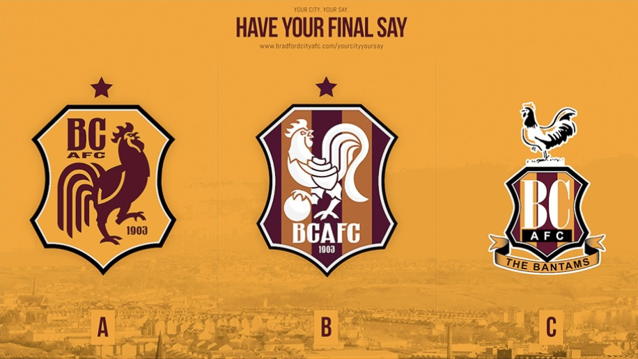
Following feedback from supporters on social media the club ran a ballot of three options: (i) an amended version of the first draft; (ii) a new design with a bird facing in the opposite direction but looking backwards whilst simultaneously balancing on a ball; and (iii) the option of retaining the 1991 crest.
The outcome of the ballot was to retain the existing crest for all its faults.
My preference in the whole affair had been for the first effort. In the ballot I voted for ‘A’ notwithstanding that I thought it was a weaker design. My criticism of ‘B’ had been on the basis that the bantam – a small, plucky bird denoting underdog status – was depicted as a giant rooster standing on a ping pong ball and to add insult to injury it had been given white plumage instead of claret & amber.
Thus whilst other clubs are embarking on a change of crest that won’t be the case at Valley Parade!
Link to the official BCAFC website with detail about the design processs
