
In June it was announced that Bradford City AFC will return to a striped shirt for the 2019/20 season…

I was both amused and saddened by the quote credited to a club official a few years ago in respect of the design of team strip: ‘It is difficult to determine what is traditional given the various changes in recent years’. My observation is that given the embedded practice of radical changes every year there is a risk of this statement becoming self-fulfilling and before long we won’t have any identifiable tradition beyond the kit manufacturer’s design studio.
The commercial imperative is now to change the design for the sake of it and then to accommodate a template design provided by the manufacturer. Surely there is a strong argument that the choice of team strip is too important to be left to the club and its kit manufacturer alone.
So what is the club’s traditional strip? Is it the favourite shirt that we recall from our early years supporting the club and by definition something unique to everyone of us? Is it the City Gent strip of the 1965/66 to 1971/72 era, the 1911 FA Cup Final shirt or the reincarnated hoops of our celebrated League Cup campaign? Each of these examples have been popular and significant in the club’s history and could be described as ‘classic’. Maybe the best way to answer the question is ask the same of other clubs. For example we would have little difficulty identifying the traditional shirt design of Liverpool, Newcastle United or Manchester United for the very reason that whoever is in charge of those clubs knows that the one thing they can’t – or indeed shouldn’t – change is the generic shirt design.
With the exception of Cardiff City who recently abandoned blue for red before reverting back again, tradition is generally written in tablets of stone. However there have been many other precedents of clubs changing their colours. In 1911 for example Bradford Park Avenue abandoned its traditional red, amber and black colours for green and white and subsequently alternated between the two combinations. Green and white had been introduced in February of that year following the appointment as manager of Tom Maley, previously a Glasgow Celtic player and administrator as well as avowed Irish nationalist. Adoption of those colours was part of the offer made by the Park Avenue chairman Arthur (Harry) Briggs to tempt the former Manchester City manager out of retirement. It is quite possible that they were also viewed as a means to attract local Irish immigrants to Park Avenue. It begs the question whether a similar colour change might one day be introduced at Valley Parade to attract ethnic support.
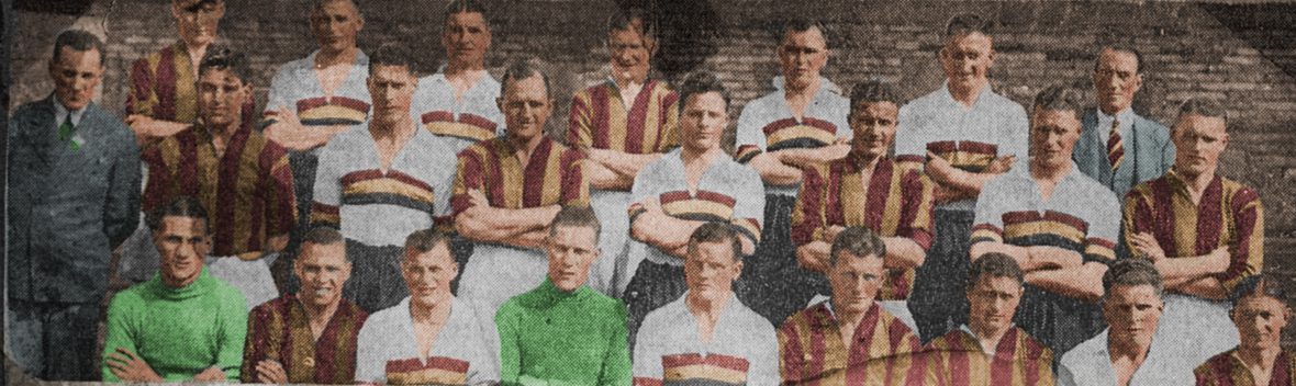
In the very beginning Manningham FC wore black shirts and black shorts before adopting claret and amber hoops in 1884 prior to moving to Valley Parade [Read here about the military heritage of the colours]. The new Bradford City club wore hoops in its first Football League game, thereafter adopting claret and amber stripes with white shorts – new shirts not being available for the game, the team wore the old rugby jerseys of Manningham FC. Stripes were considered in keeping with association football whereas hoops were associated with rugby and in 1903 the new club was anxious to distinguish itself from the rugby traditions of Manningham FC at Valley Parade, notwithstanding the retention of claret and amber. Until 2012/13 hoops were not worn again by Bradford City.
The determinant of kit design has always been commercial in nature. In the last twenty years decisions have been based principally around selling replica shirts as a leisure garments whereas previously it came down to securing the playing kit for as cheap as possible. Because the club’s colours – claret and amber – are relatively unique there have been constraints in terms of what a manufacturer can supply. Even now, standard template designs are a factor for what can be manufactured.
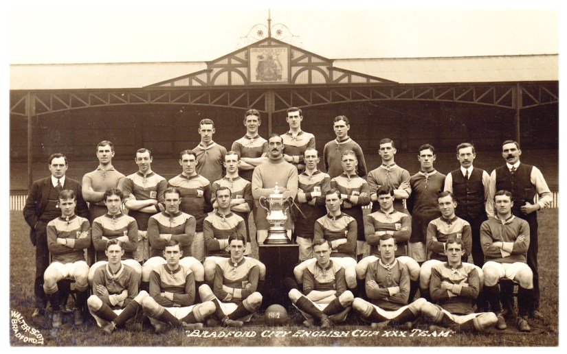
In 106 seasons of peacetime League football there have been four main colour combinations in the design of club strip. My classifications allow for broad and elastic interpretation given the imagination of recent designs but confirm that in 61 seasons claret and amber stripes have been worn (which includes the recent diagonals and chequer board styles). This also includes the 2013/14 single striped shirt and the number would increase to 65 if we include seasons in which claret and amber stripes have appeared on a white shirt. In 29 seasons there has been a predominantly claret shirt – ranging from the yoke shirt worn in the FA Cup Final and revived in 1949 to the claret shirt with amber collar worn until 1909 and then again between 1953 and 1959. Of the remainder, 5 have been in a predominantly amber shirt and 10 in a predominantly white shirt (or 6 if the kits of 1923/24 and 1974 to 1977 are classified as ‘striped’) and one in hoops.

Taking the 106 League seasons, the most common configuration has been claret and amber stripes with black shorts (28). The next has been a predominantly claret shirt with an amber collar or yoke design worn with white shorts in 26 seasons, albeit not adopted since 1959.
The other main combinations have been claret and amber stripes with white shorts (17) and finally claret and amber stripes with claret shorts (16) which has been the most common combination this century (in 10 out of 20 seasons) and which first appeared in 1977.
Predominantly white shirts as worn in 1923/24 and later between 1974 and 1977 as well as 1978 to 1985 have proved to be a temporary phenomenon. White was historically the club’s third colour and traditionally used for away shirt design up to 1972. (This was the traditional default change kit of League clubs and regulations stipulated that clubs should travel with white shirts in case of a colour clash.) During the inter-war period the shirts were often reversible and could be worn inside out if necessary. Shirts were also worn until they wore out. That often meant being used for away shirts (for example the white shirts with sashes originally worn in 1923/24 or the amber shirts first worn in 1973/74) and until the early 1980s it remained the practice for old kit to be worn on the training ground.
It was originally planned for white shorts with a claret and amber striped shirt to be worn in 2004/05 and stock was produced by Diadora, the suppliers. However, the strip was only worn in a handful of League games at the start of the season – an unusual legacy of our financial troubles at the time. White shorts were reintroduced with the claret and amber hoops in 2012, the first time that they had been worn by the club since 1985.
Following the fire disaster in 1985 the club has had a policy of including black in the home shirt design as a commemoration of the Valley Parade disaster. With effect from 2008 this has been incorporated in a crossed ribbon motif.
Away shirts have been of varied and multiple designs in the last thirty years. My understanding is that the first time that the club strayed from its traditional colours was between 1958 and 1961 when blue shirts were adopted.
Advertising was introduced in the 1982/83 season when the Darley Street retailer TOY CITY had its name proudly emblazoned on the shirt. There has been a high turnover of advertisers during the last 38 seasons, of which JCT 600 (16 seasons), Bradford Council Economic Development Unit (5 seasons; Myth Breakers, 1983-88) and Bradford & Bingley (4 seasons, 2006-10) have been most prevalent. JCT 600 is the only sponsor to have had two separate periods of sponsorship from 1997 to 2006 and again from the 2013/14 season.
The principal designs of claret and amber home shirts are as follows:
Predominantly claret body, white shorts (26)


Claret and amber stripes, white shorts (17) – see also the title image of this blog


Claret and amber stripes, black shorts (28)


Claret and amber stripes, claret shorts (16)


For what it’s worth my preference is for a claret and amber striped shirt but given that this isn’t everyone’s favourite and mindful of the commercial pressure for change, I’d like to see the club rotate its home shirt design between the three traditional styles that have been worn since 1903. That is: (i) a striped shirt; (ii) a predominantly claret body with amber collar or yoke; and (iii) a predominantly white shirt with claret and amber stripes / detail.
Last season’s home shirt was a major disappointment and certainly didn’t pay homage to tradition with its black sleeves. The final design of last season’s shirt is understood to have been dictated by Edin Rahic against the advice of club staff. Rahic apparently described the shirt as evoking a warrior spirit. Ironically the internal recommendation had been to adopt a style similar to that of 1907-09 and as worn in the Division Two Championship season of 1908/09 which would have been a claret shirt and amber collar/cuffs with white shorts.
Updated from ‘A History of Bradford City AFC in Objects’ (BANTAMSPAST, 2014)
John Dewhirst
Tweets @jpdewhirst
Revival of white as the BCAFC away strip in 2019/20
===========================================================
Thanks for visiting my blog. You will find links from the menu above to other features I have published online about the history of football in Bradford and Bradford City in particular. I contribute to the BCAFC match day programme and you can also find archive images as well as a number of book reviews. The links provide free, accessible history about BCAFC based on substance rather than soundbites.
Links to features about the Bradford City crest and identity
===========================================================
If you are interested in the history of Bradford sport then visit VINCIT www.bradfordsporthistory.com where you will find features about the history of different sports and clubs in the district.
Recent articles published on VINCIT written by myself include:
The Paraders’ record breaking season of 1928/29
Centenary of Scholemoor Ground, Lidget Green and revival of Bradford RFC
The story of Shipley FC and Bradford’s other c19th junior rugby clubs
The origins of women’s football in Bradford
The significance of sport in shaping a Bradford identity
History of the Bradford Charity Cup
Compendium of Bradford sports club names
The late development of soccer in Bradford
John Nunn, Bradford physical aesthete
The history of Bradford rugby and the case to reassess the split in English rugby in 1895 My findings from investigation of the origins and development of Bradford football provide sufficient evidence to challenge the orthodox view that the split in English rugby was driven by social class as opposed to the economics of sport.
The myth that the City – Avenue rivalry was based on class politics
The political origins of Bradford Cricket Club in 1836: Blaming the Tories
Cricket: the DNA of Bradford sport
===========================================================
Details of the books published in the BANTAMSPAST HISTORY REVISITED SERIES

